Farewell Pro
Display Type design | Year: 2015.Curated by Behance

Idea
Space.
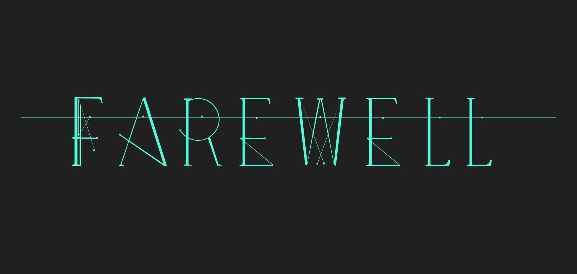
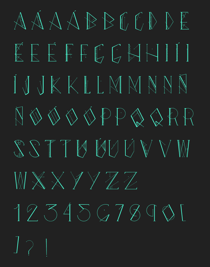
All the fonts that I have designed have always been based on a figurative idea. Farewell was one of the first that I have designed with space, stars and constellations in mind.
Farewell is a decorative typeface to be used in titles and short texts.

Construction
Serif roots.
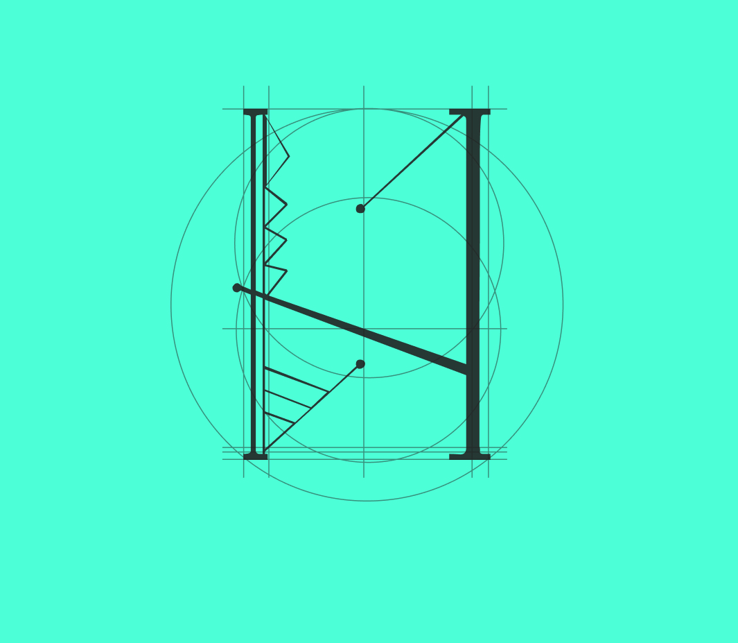
The idea was to create a typeface with touches of serif typeface and at the same time quite futuristic and geometric, where the lines intersect and meet at different points to imitate the constellations.

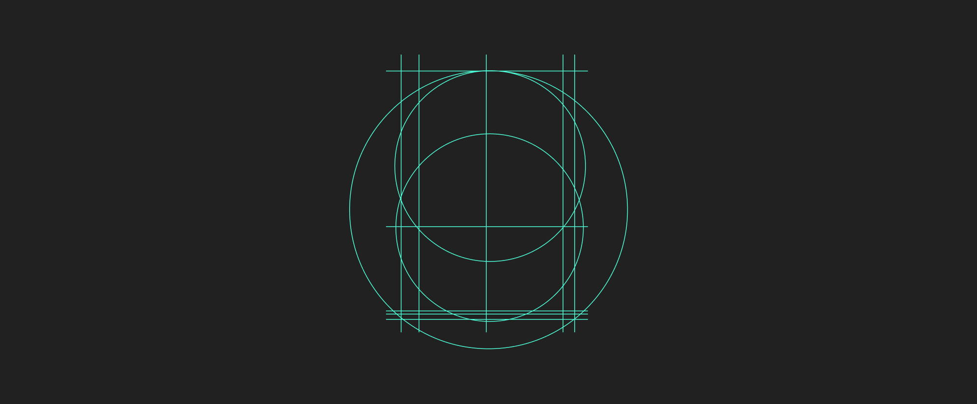
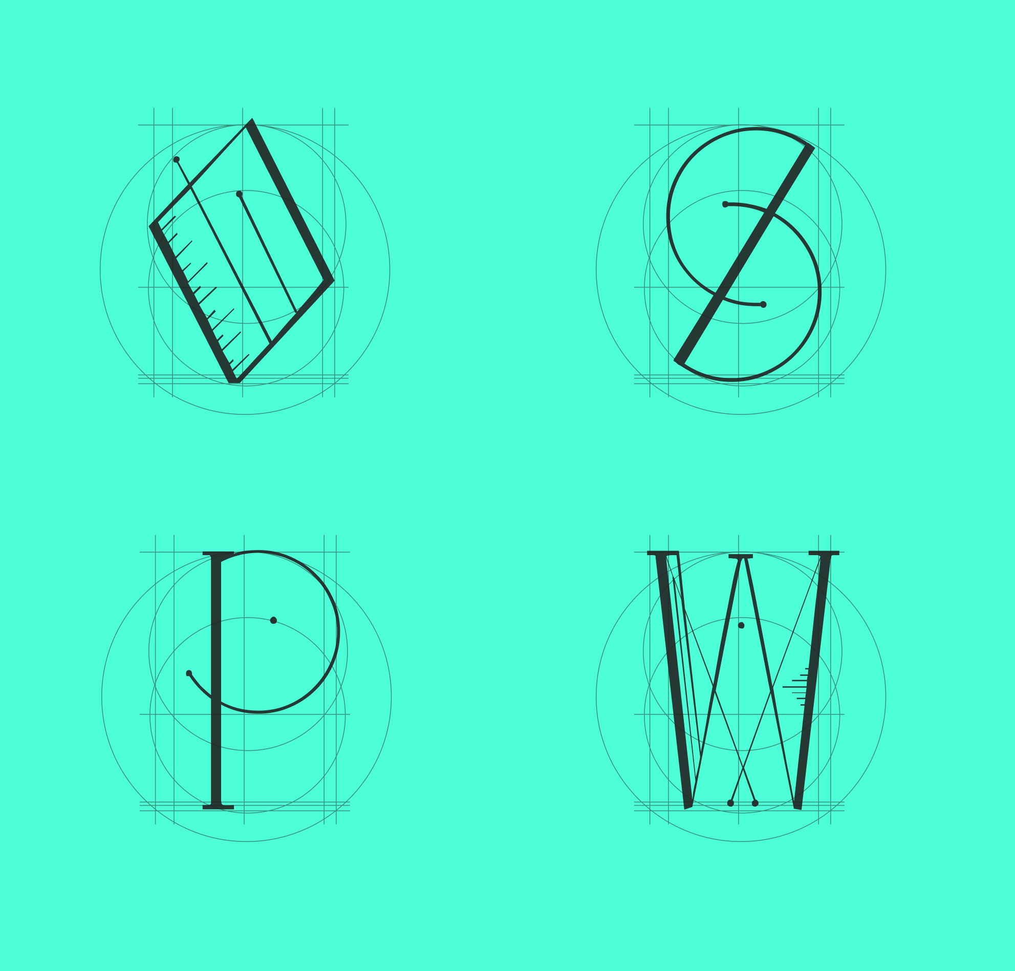
Grid
The importance of using a base.
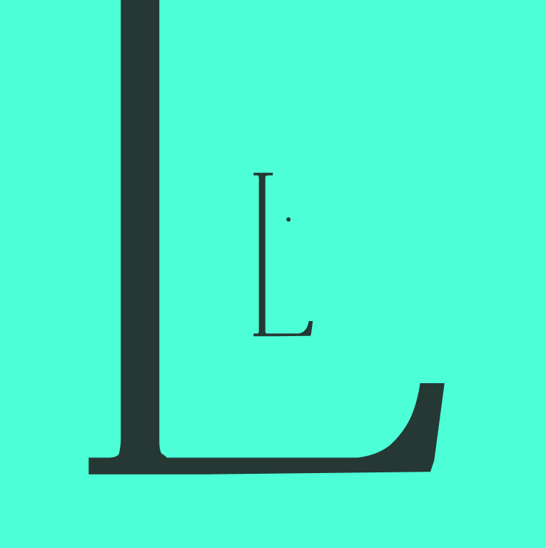
The main thing about having a basic grid to build each letter is that it maintains consistency and forces you to force new and risky strokes. Here it is very important to know the rules of the weights of each pole how the letters are built.
