Neurona Type
Font type design | Year: 2014.

Idea
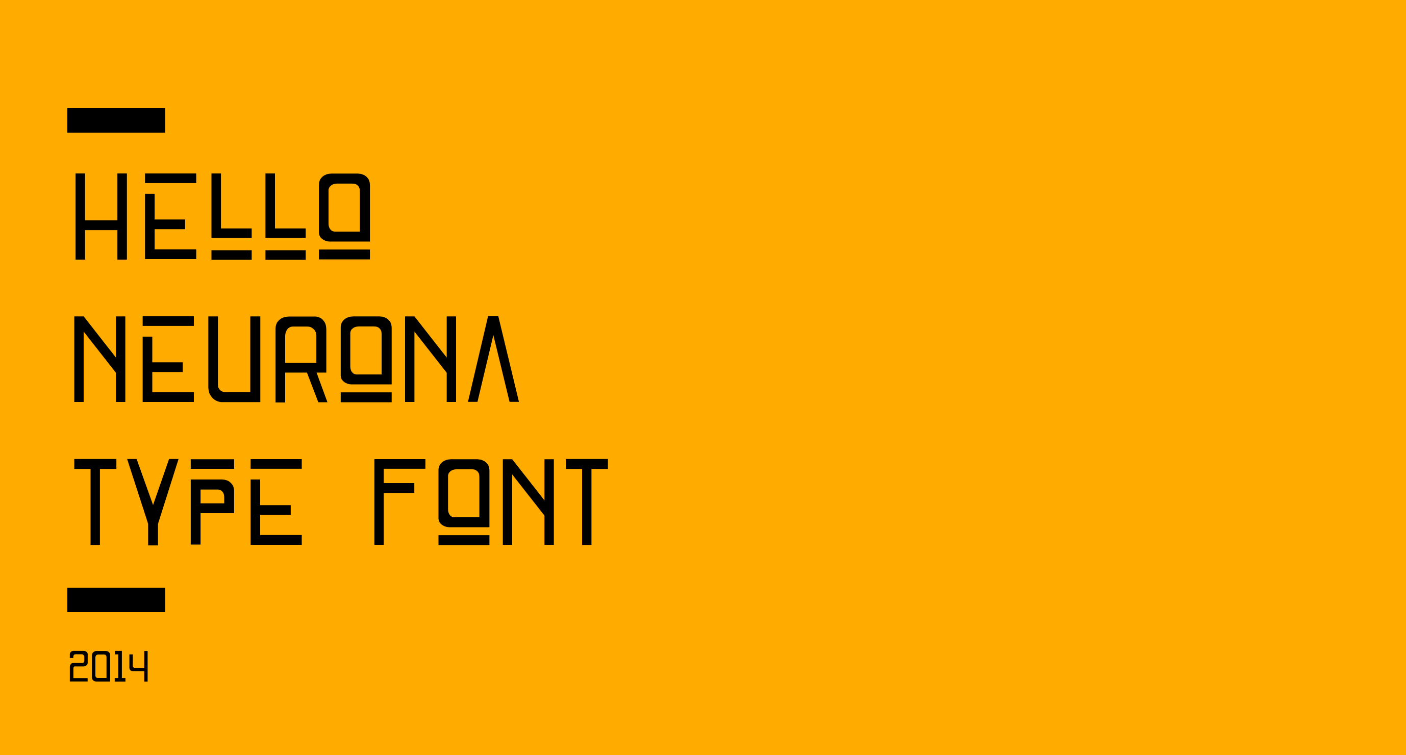
Geometric type.
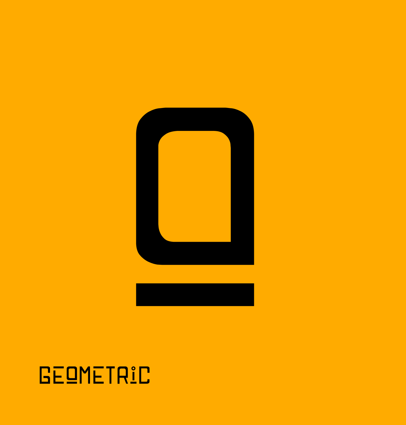
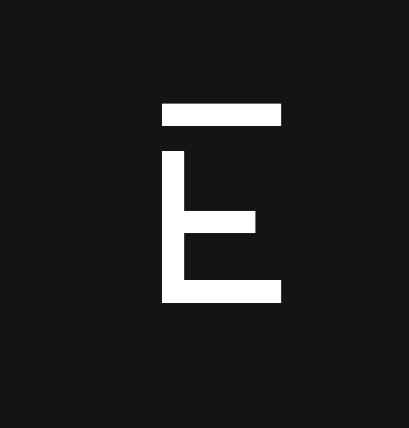
The idea was to create a totally geometric and disruptive typeface, which would work very well for headlines or short texts on posters.
Anatomy
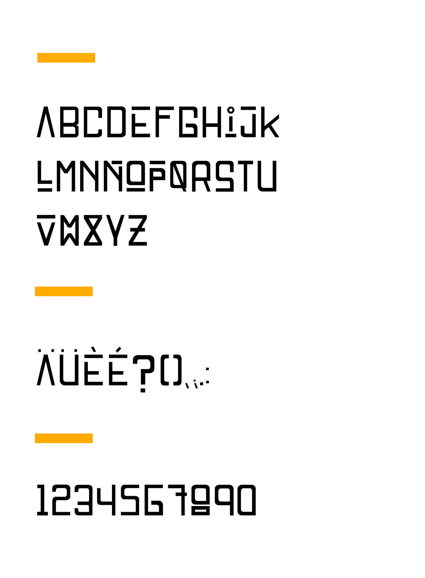
The construction.
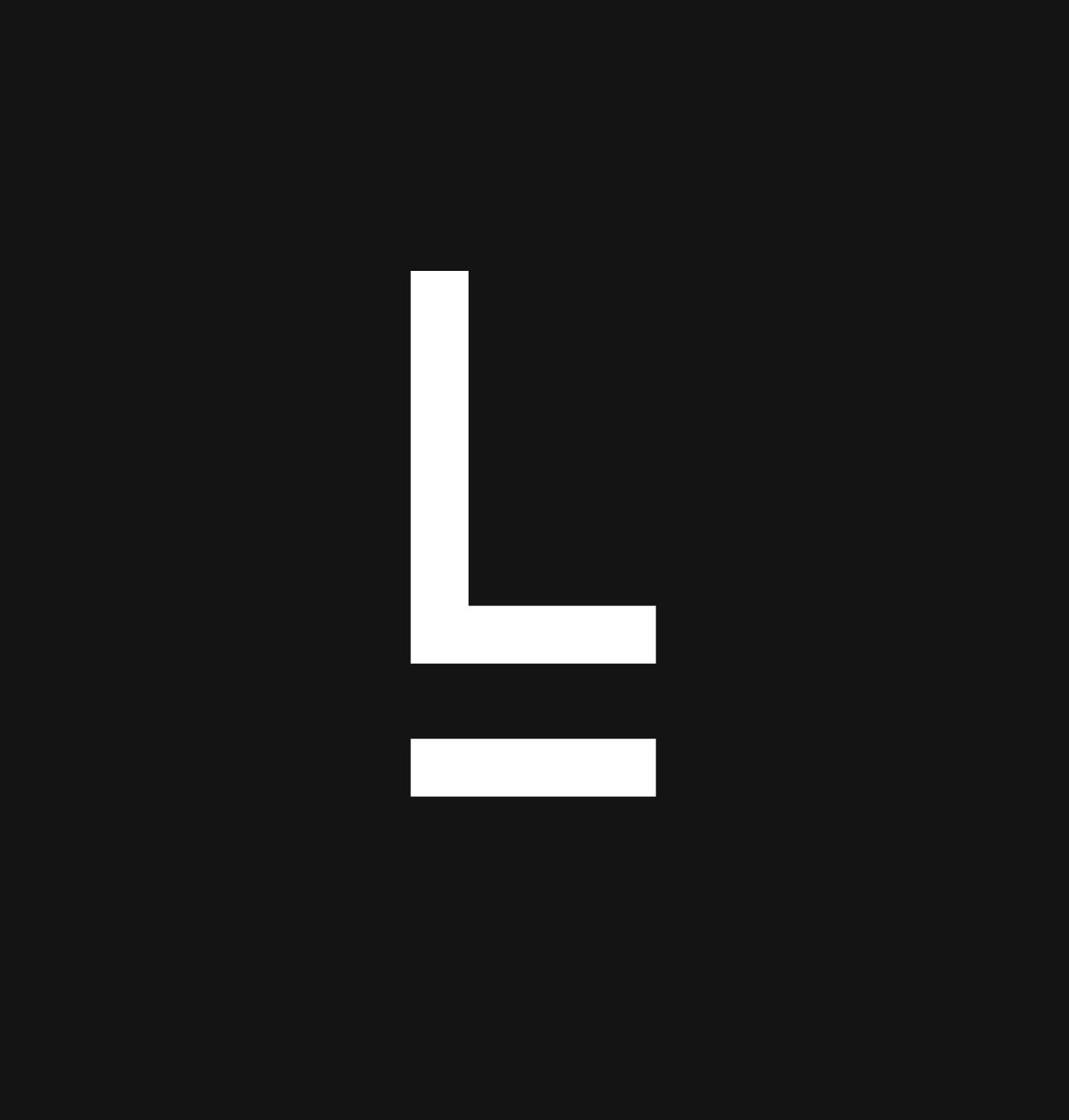
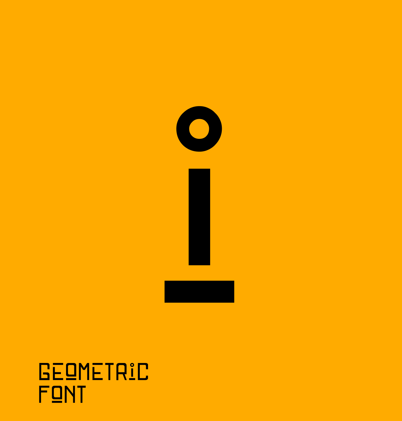
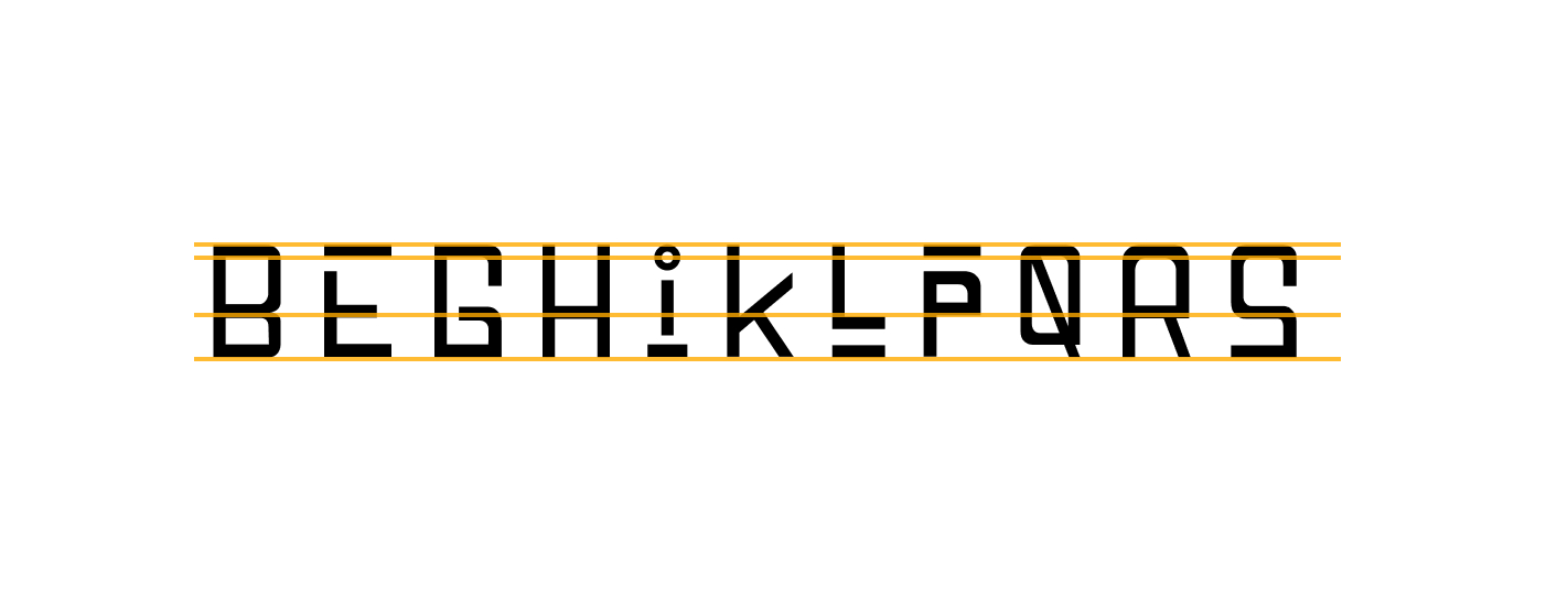
The font has only capital characters. It is built with straight shafts and rounded ends trying to break with the structure at one of its corners. The idea was to experiment with the negative spaces to see the shapes that appeared.
Disruptive
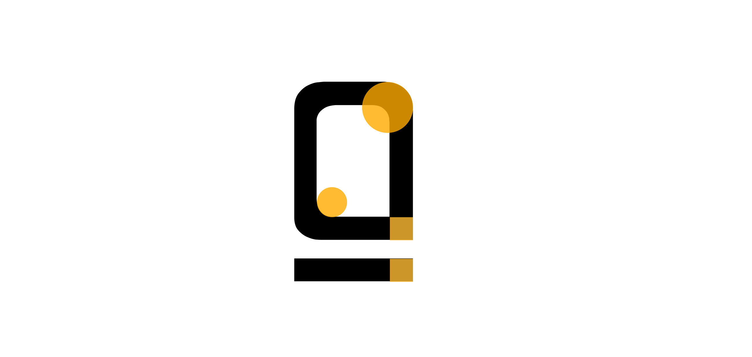
Breaking characters.
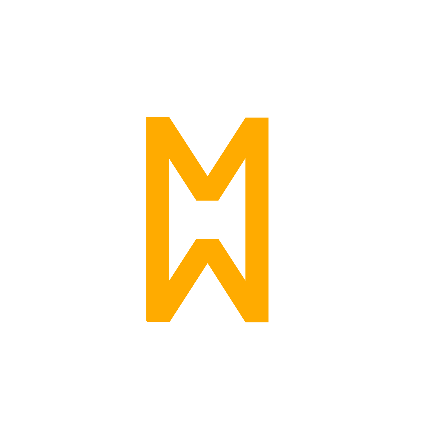
Many characters are "broken" to play with the optical unions generated by the eye, others such as the W generate a closed shape to break with the classic, the letter alone does not work, only the eye is able to understand it within a word .
