Projects

🏆 When design meets success metrics

Case study of a re-design

  • Tasks:

    Research, design, user test, business presentation, launch and measure results.

  • Team:

    Product manager,
    Tech lead

  • Company:

    seQura Worldwide S.A

  • Product:

    Promotional asset

  • Year:

    2023.

widget

Short introduction

About the company

SeQura is a fintech company that offers various buy now, pay later (BNPL) payment methods for businesses to provide to their buyers.

About my role

I am the Product Designer of the Shopper Growth and Conversion team and my goal is to find opportunities to improve the growth and conversion of the company while considering the shoppers' economic well-being and aligning them with the company's objectives.

About the widget

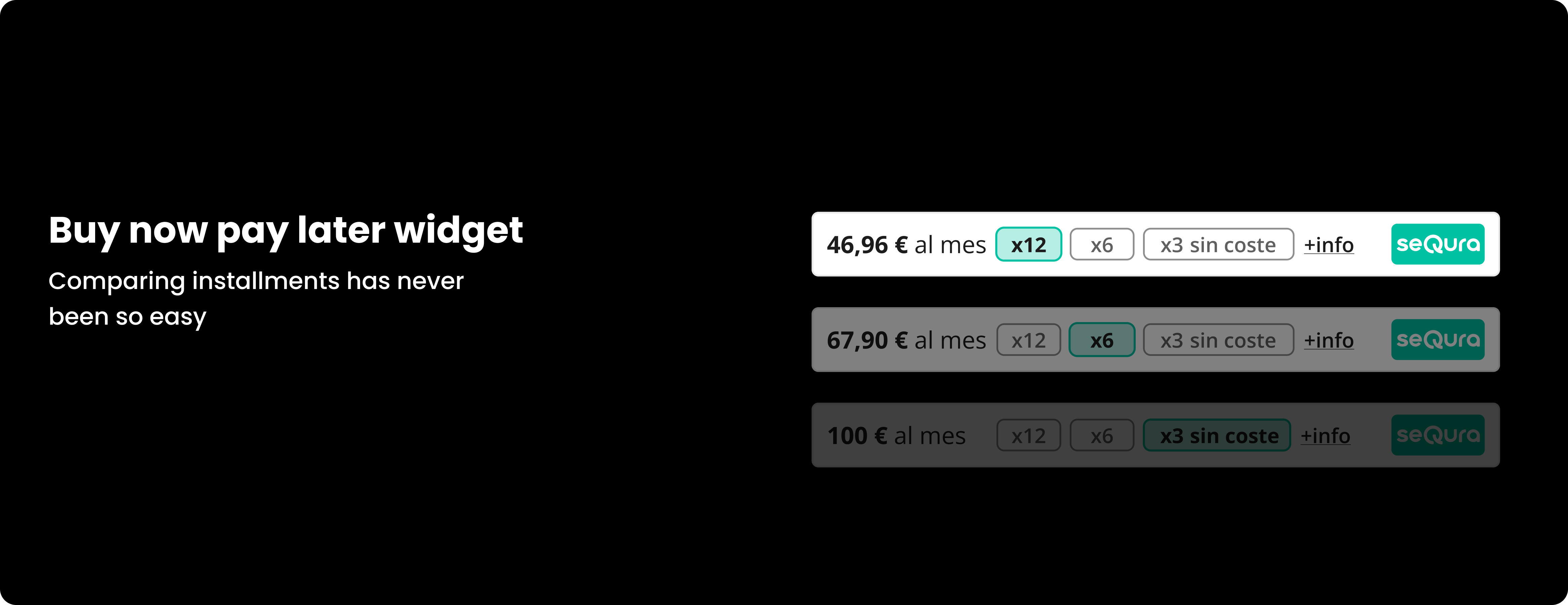
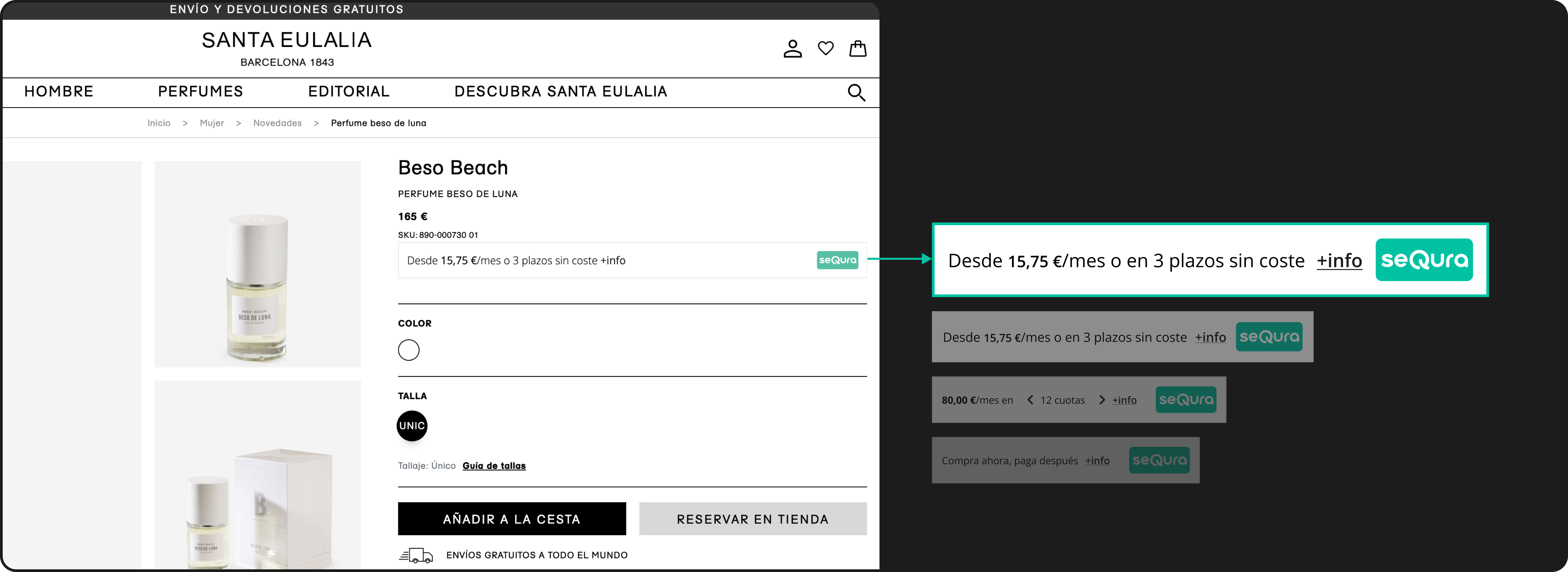
The widget is one of the promotional assets that we integrates into the merchant page to display the option of paying in installments. Specifically, this widget integrates into the product page.

Complete journey of a shopper and the location of the widget

widget

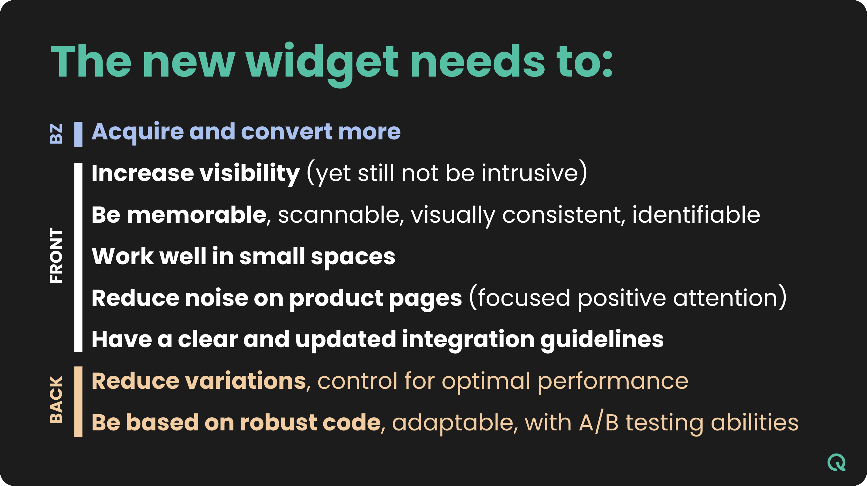
Objective of a new widget design

As a team, one of our primary objectives of the Q2 2023 is to enhance the acquisition and completion rate of the Sequra checkout process.
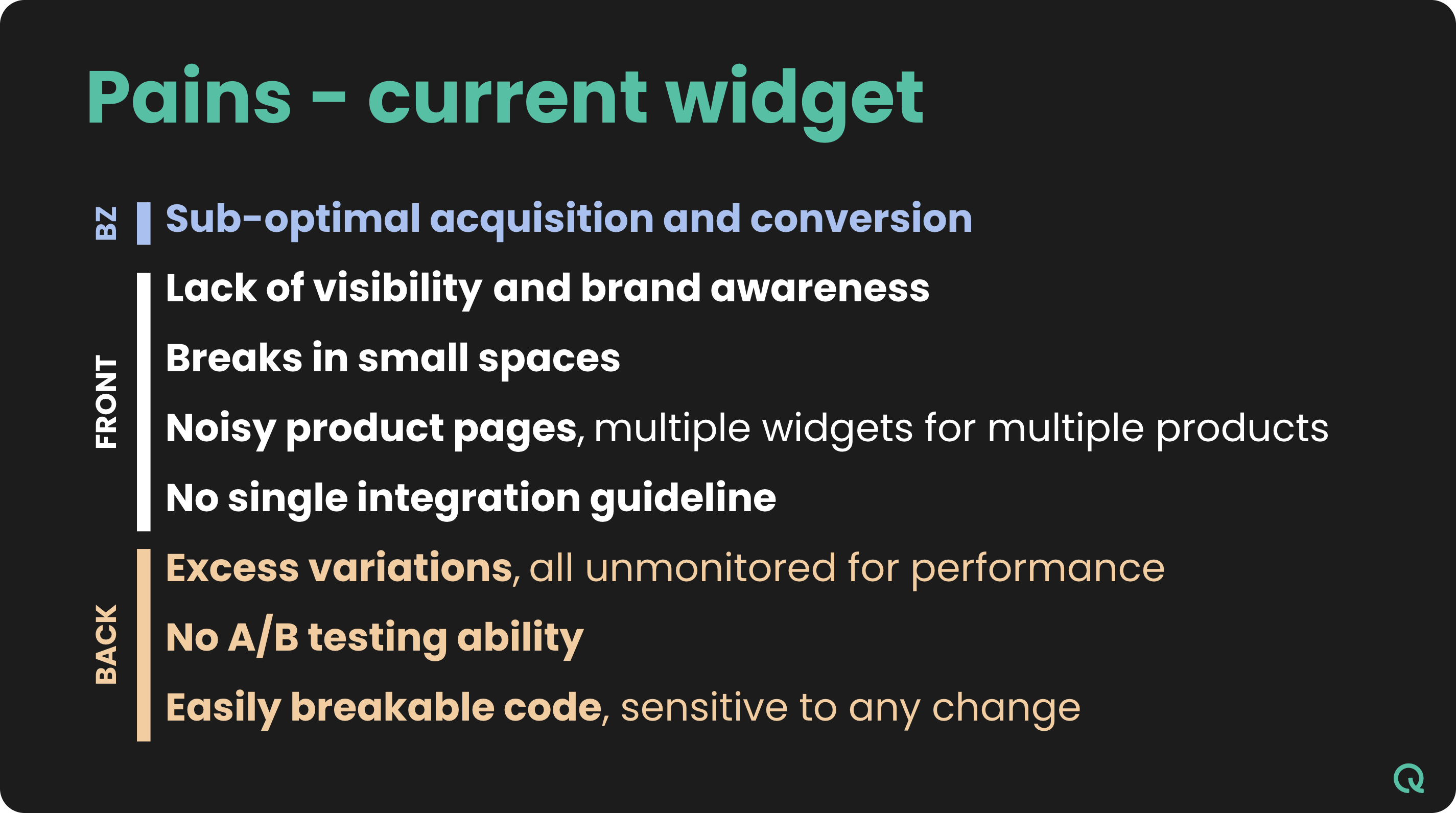
However, after analyzing all the pains and opportunities, in order to achieve this milestone in the user journey I realize the importance of improving the first touching point of communication with the shopper: the widget. Suppose more shoppers see they can pay in installments early and this asset gives them all the information they need to make the decision to use seQura. In that case, more shoppers will arrive at the checkout process and more of them will complete the checkout process successfully.
If the current widget fails to captivate the user's attention, lacks clarity, or conveys misleading information, it is important to put our my focus on improve this asset.
Due to the complex nature of the widget (legacy code), any necessary changes must be approached with careful consideration and a thorough understanding of all potential configurations. Yes, right now we allow the merchant to modify the UI of the widget, this needed to change if we wanted to have more brand presence.

Widget before the redesign:

widget

Research, understand the situation

widget

I needed to understand all point of view inside the company about the widget, for that with the Product Manager conducted interviews with main stakeholders such as the CRO, Key Account Managers who have direct contact with businesses, and integrators who are responsible for ensuring a seamless integration of the widget on the commerce website.
I needed to see the metrics, assesing and comparing the click rate of the widget with the number of impressions (due to privacy concerns, I'm unable to disclose these specific metrics).
Understand the technical complexity with the tech lead of the team we evaluated the complexity of a complete redesign of the asset. I needed to mitigate and valorate all the risks in redesigning the widget.
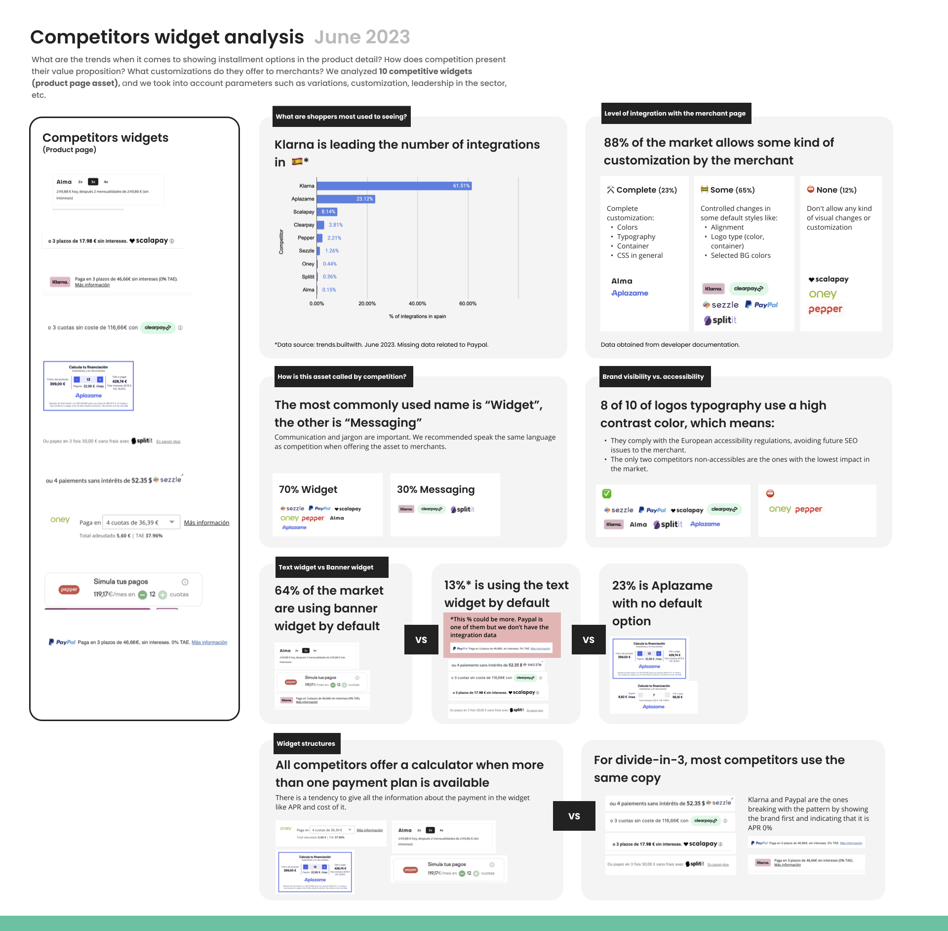
Finally, I carried out a brief benchmark, as we are not the only financial service providers in Spain, I needed to have a detailed view of the key areas our widget should improve to compete in the market. 👇

widget

Conclusion and insights

widget
widget

Design Process, widget Construction

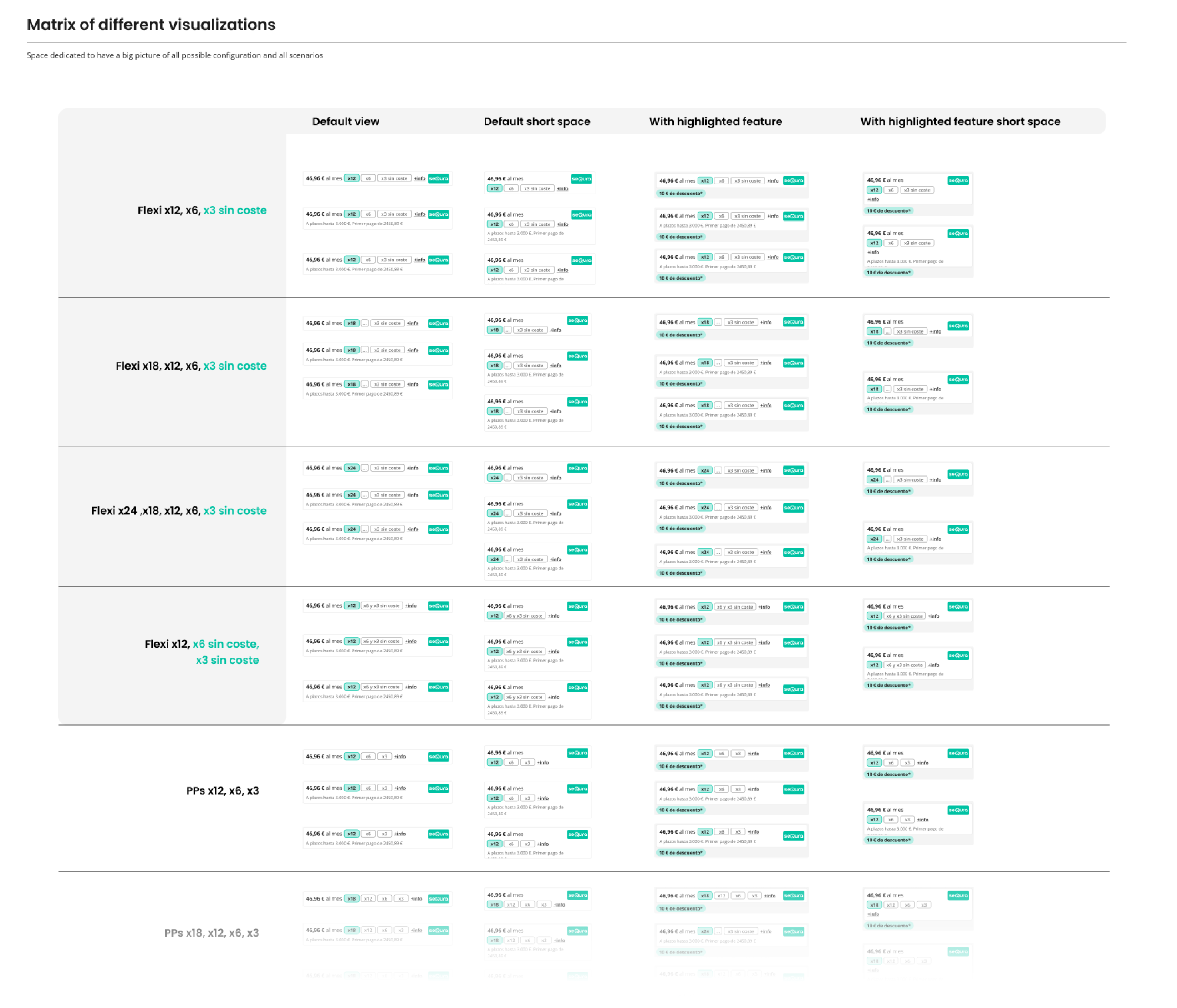
Given the complexity, development effort, and impact of this asset, it was important for me to ensure that the design could adapt to all potential scenarios while achieving the objectives.
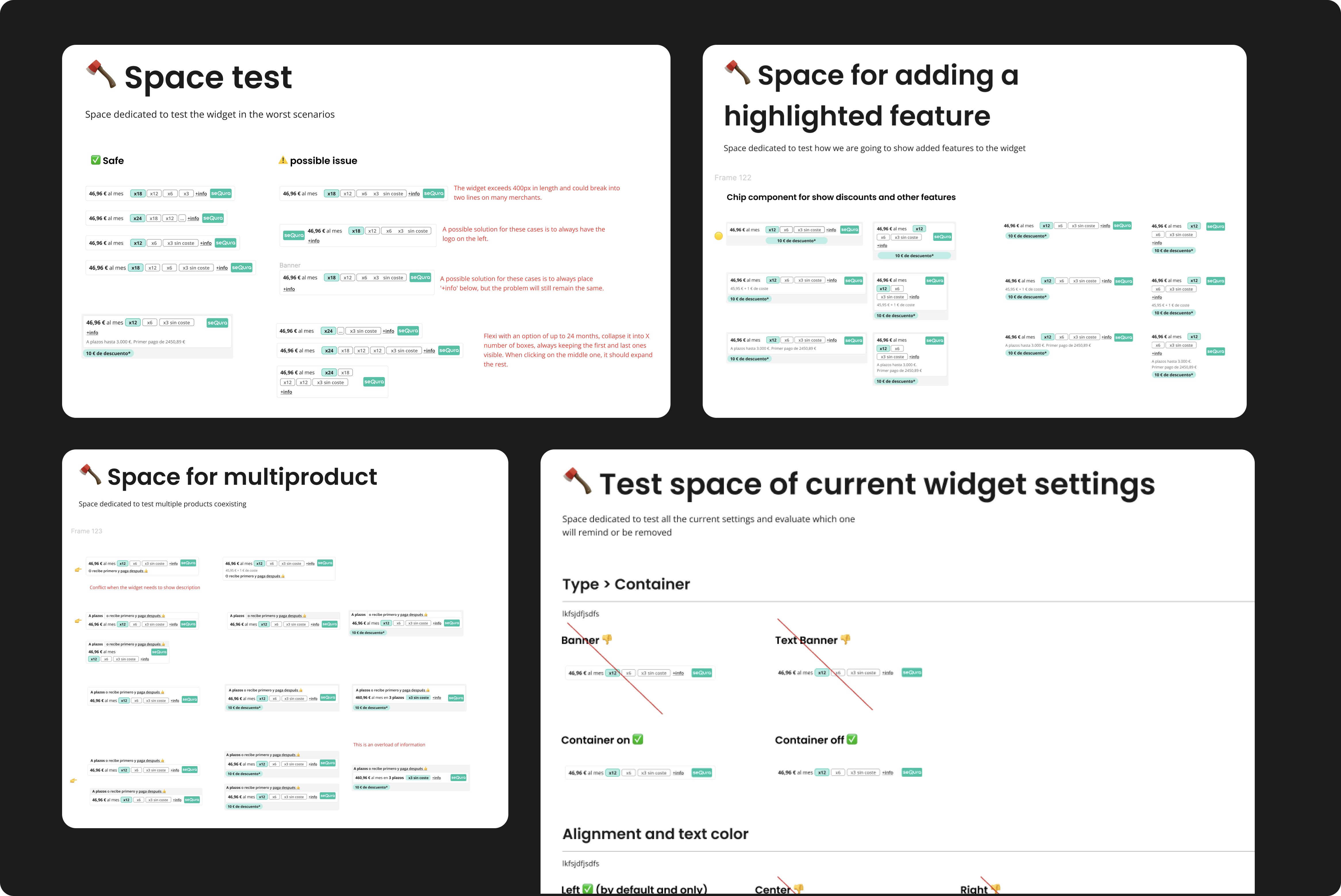
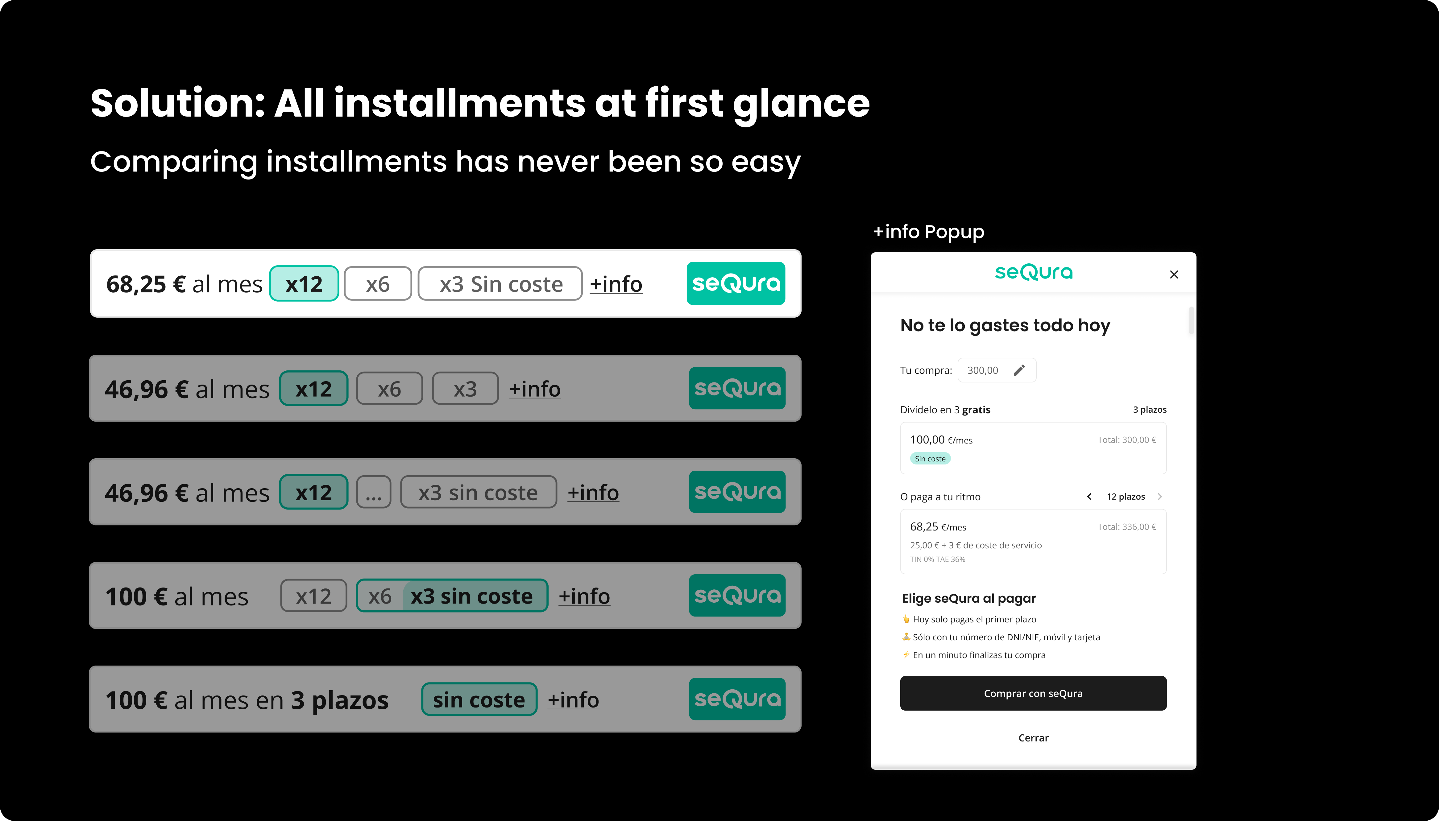
My approach can be summarized as follows: designing, testing different combinations, intentionally breaking it, and then starting again.
To accomplish this, I established different testing environments with the aim of pushing the design to its limits (breaking it).
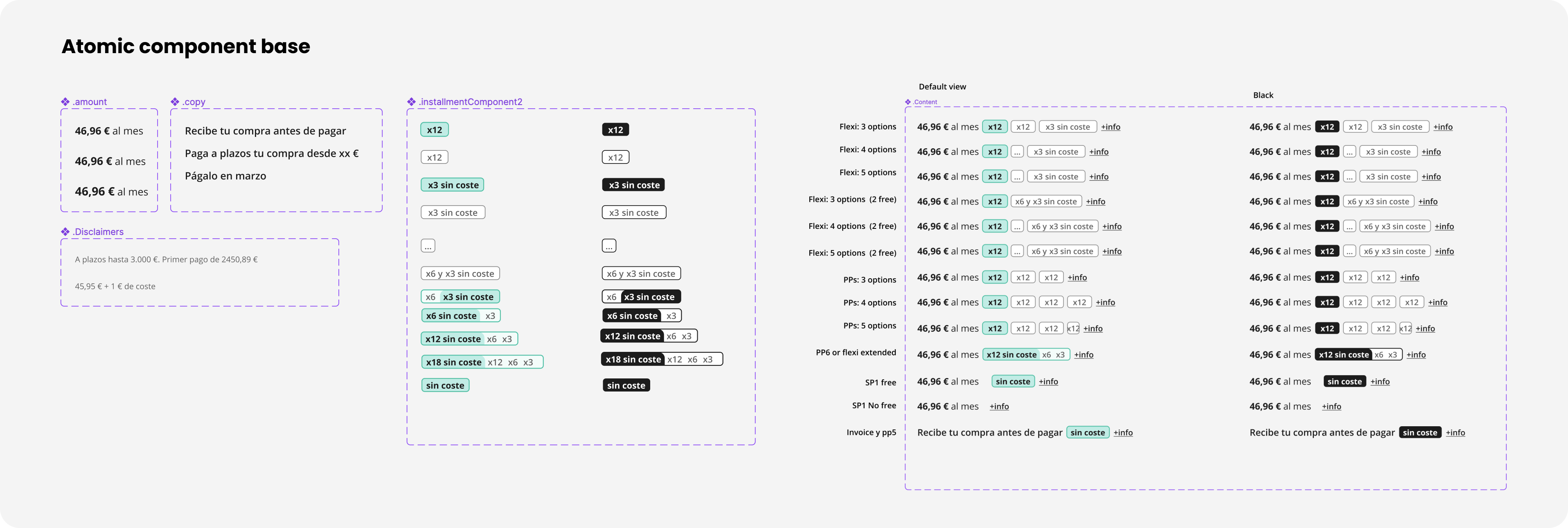
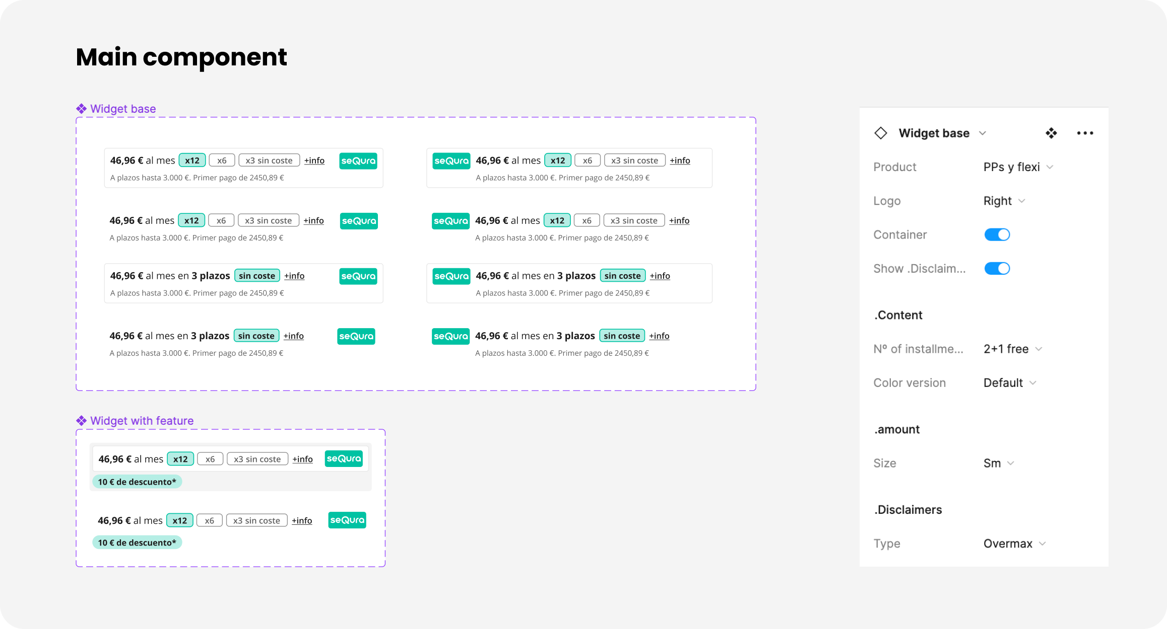
Once a design successfully passed all the testing environments without breaking, I enhanced the Figma component to facilitate faster implementation of any future changes.

Building the Figma component
native app
native app

Testing worst scenarios

native app

Why this design and not another?

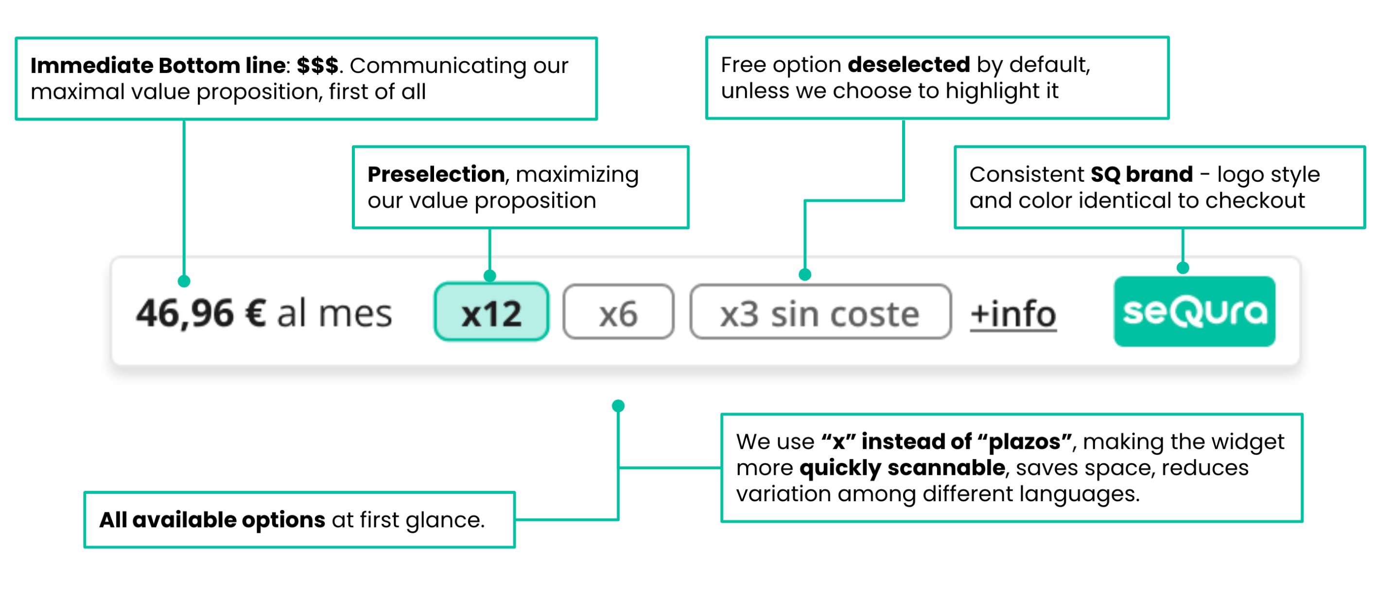
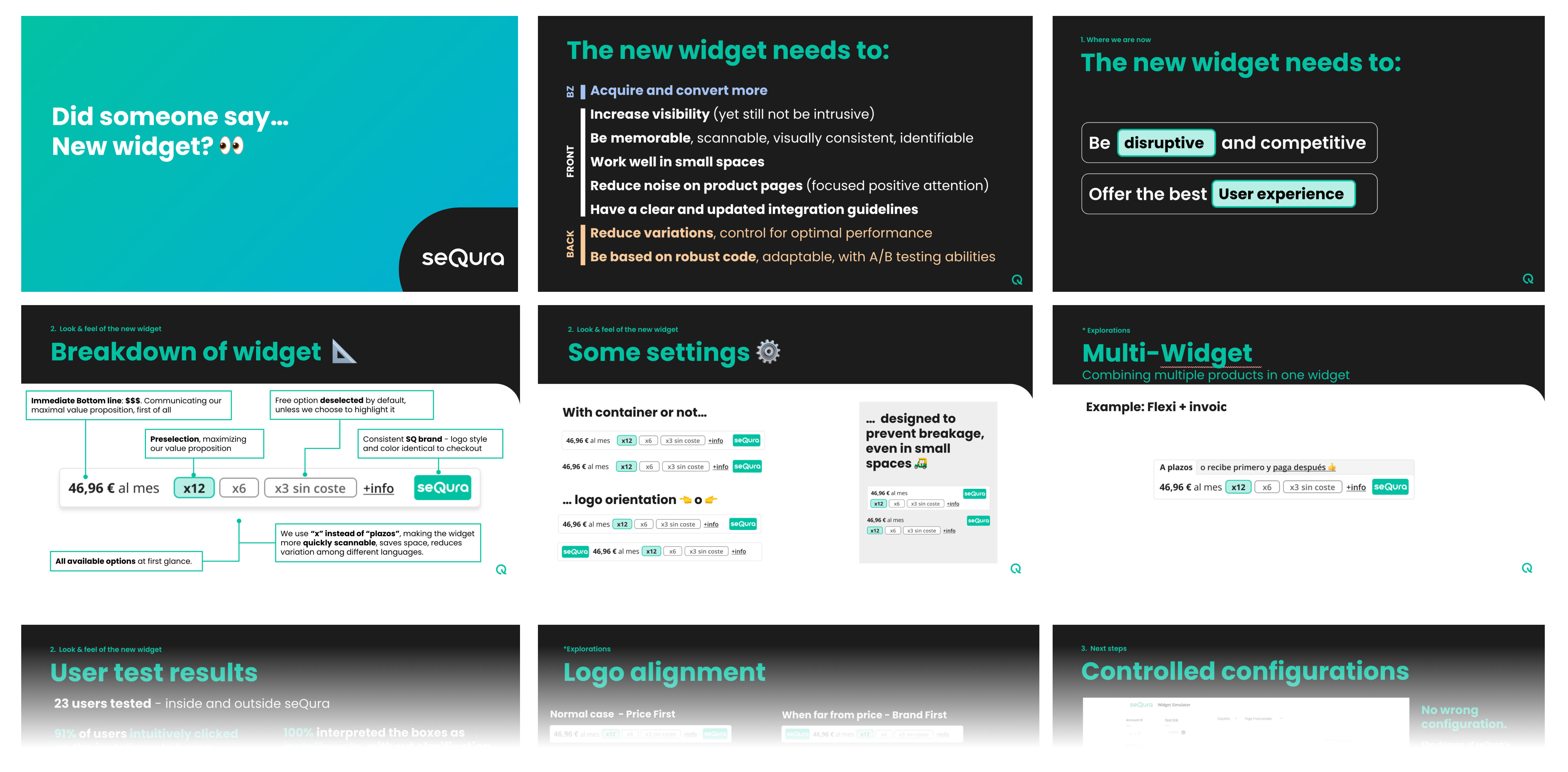
I confidently chose this design because I wanted to create something disruptive that would make it effortless for users to compare the different installments. I aimed to establish a stronger visual brand presence and simultaneously capture the attention of both readers and scanners. To achieve this, I made the decision to reduce texts and prioritize highlighting the value offered, specifically the lower price of the product being viewed.

native app

Test with Real Users

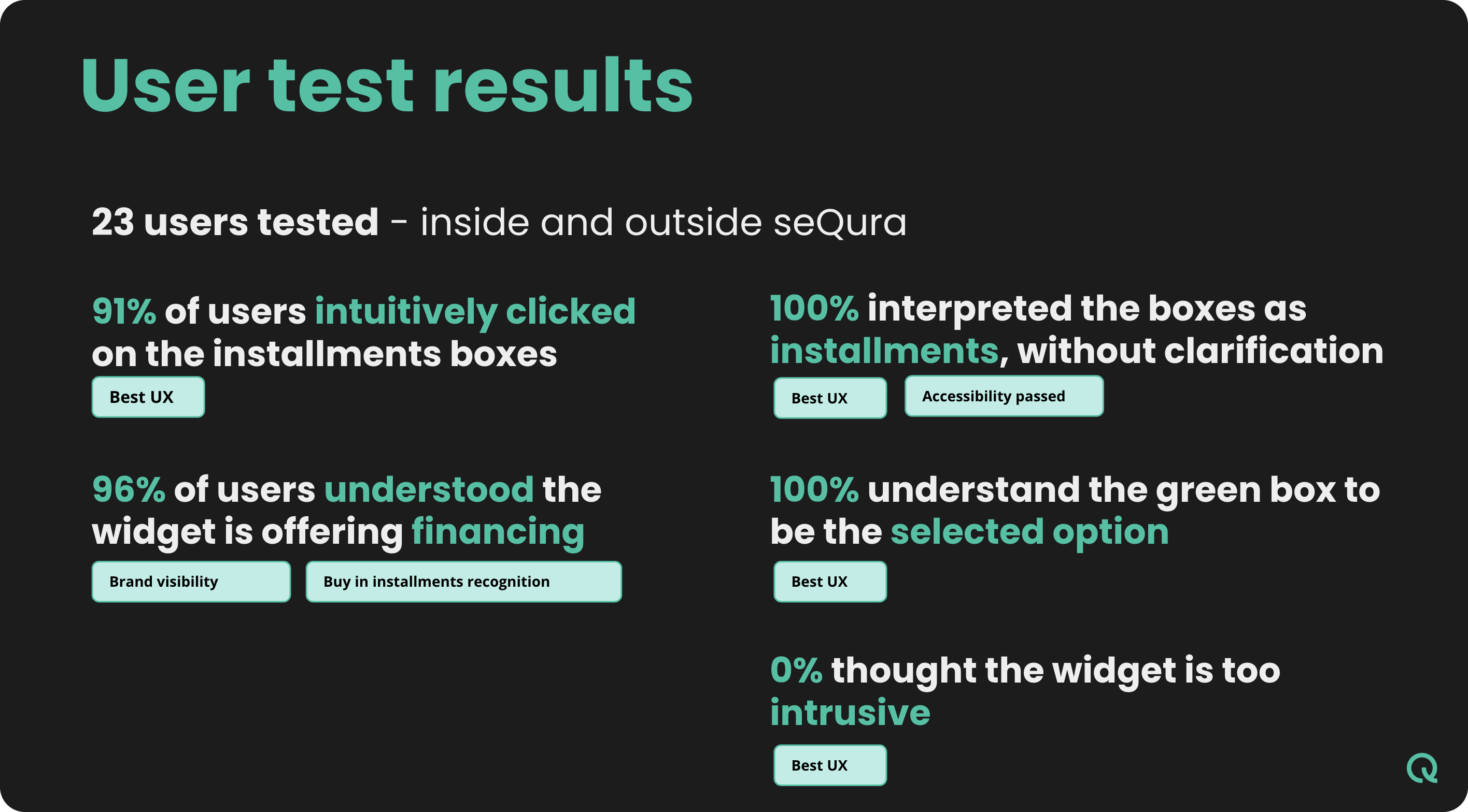
It doesn't matter if the design is disruptive or not, what matters is having the confidence to test the designs before they reach the production process, without relying solely on the designer's judgment.
Conduct a usability test with real users, following these steps:
- Number of users: 23
- Schedule a 10-minute video call.
- Ask questions to assess their knowledge and experience with financing methods.
- Test their recognition of the new widget on a simulated commerce page in Figma.
- Track the number of interactions.
- Evaluate their level of understanding.
Note: During the interview process, I performed various tests involving color and typography to determine which options resonated better with the users.
Note2: I involved the whole team in the user test so they can see how the user interacts with the widget.

native app

Final Design

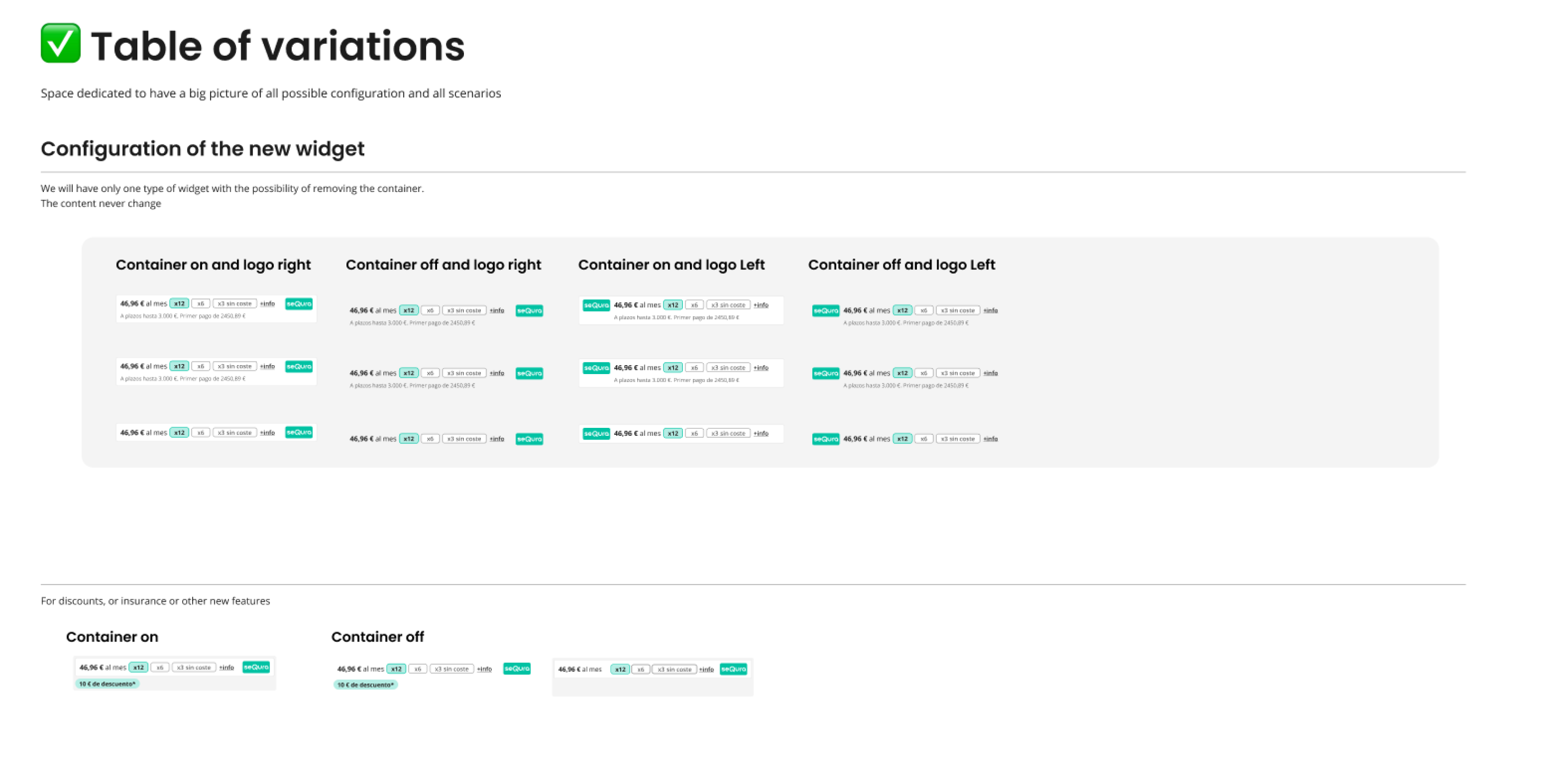
A unified design that seamlessly caters to all the products on offer.Streamlined customization options, resulting in a stronger brand presence, while still prioritizing the requirements of the merchants.

native app

One component for all products

native app
native app

Presentation to Stakeholders

Why is it absolutely vital to master the art of selling a design? After all the hard work and dedication, it is super important to show our stakeholders that we not only heard and understood their concerns but that we are perfectly aligned with their needs. Our new design not only "catch" to the shoppers but also takes into account the merchants, ensuring comprehensive coverage of all possible scenarios.

native app

Pilot launch and metrics

We decided to proceed with a pilot launch of the new widget in approximately 30 businesses. This approach allowed us to validate not only the user tests but also gather feedback from the merchants.
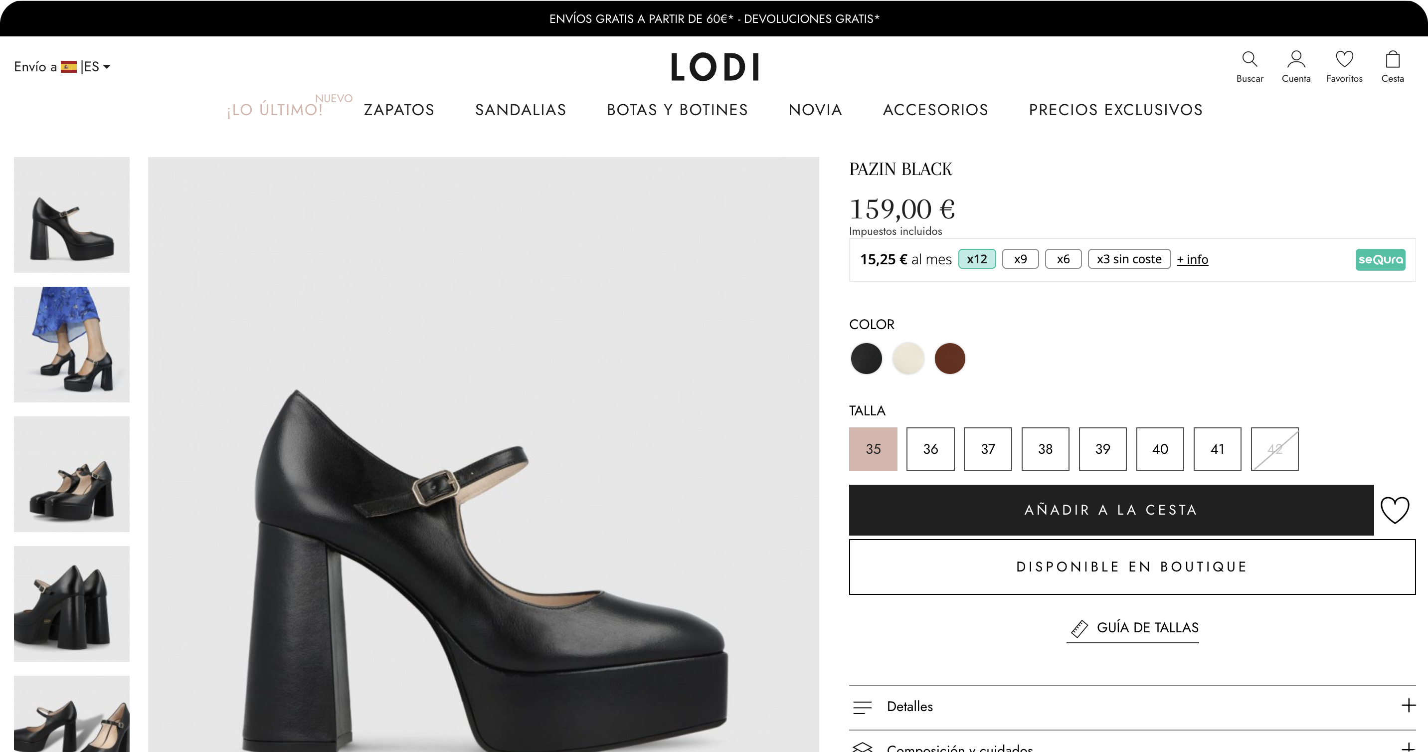
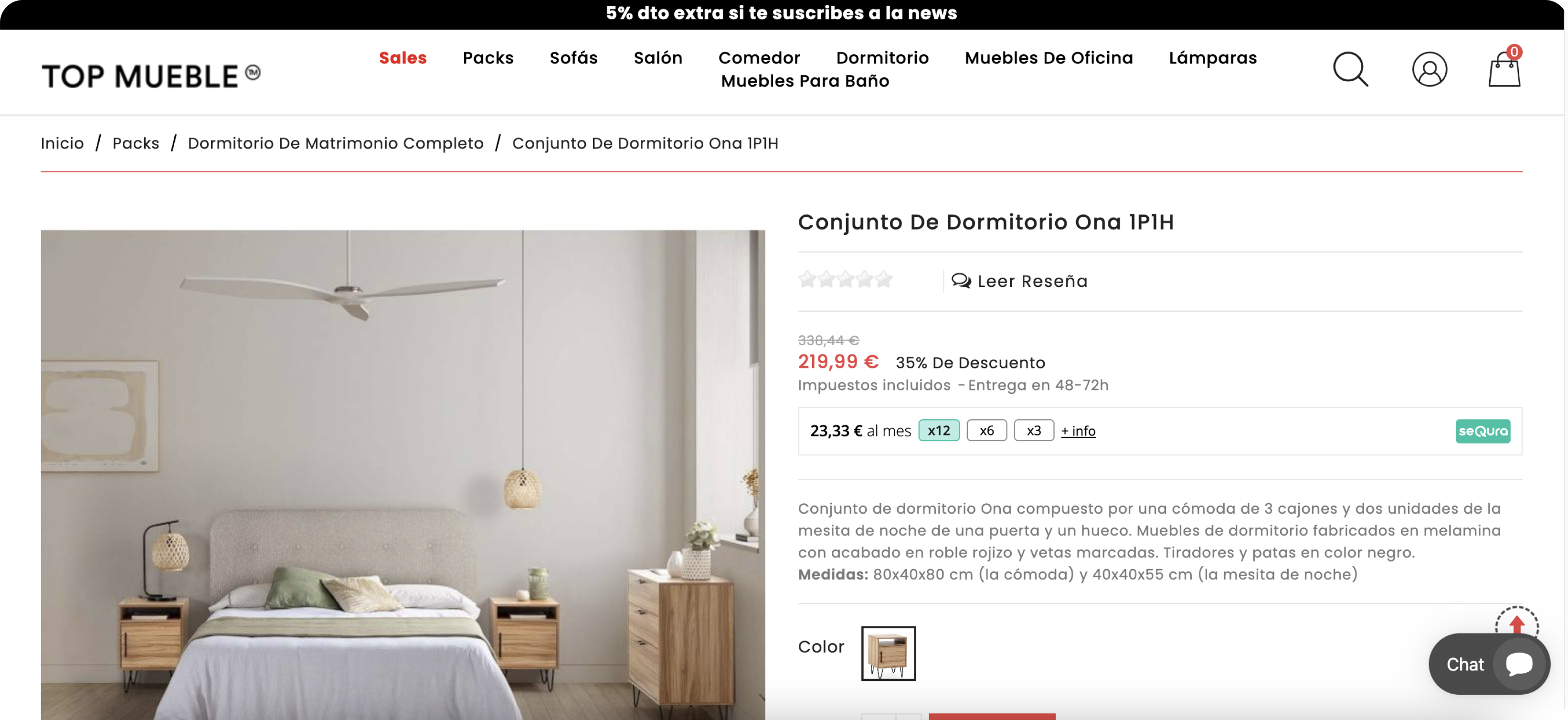
You can click on some of the merchants and see for yourself.
Here are the results of the pilot launch.

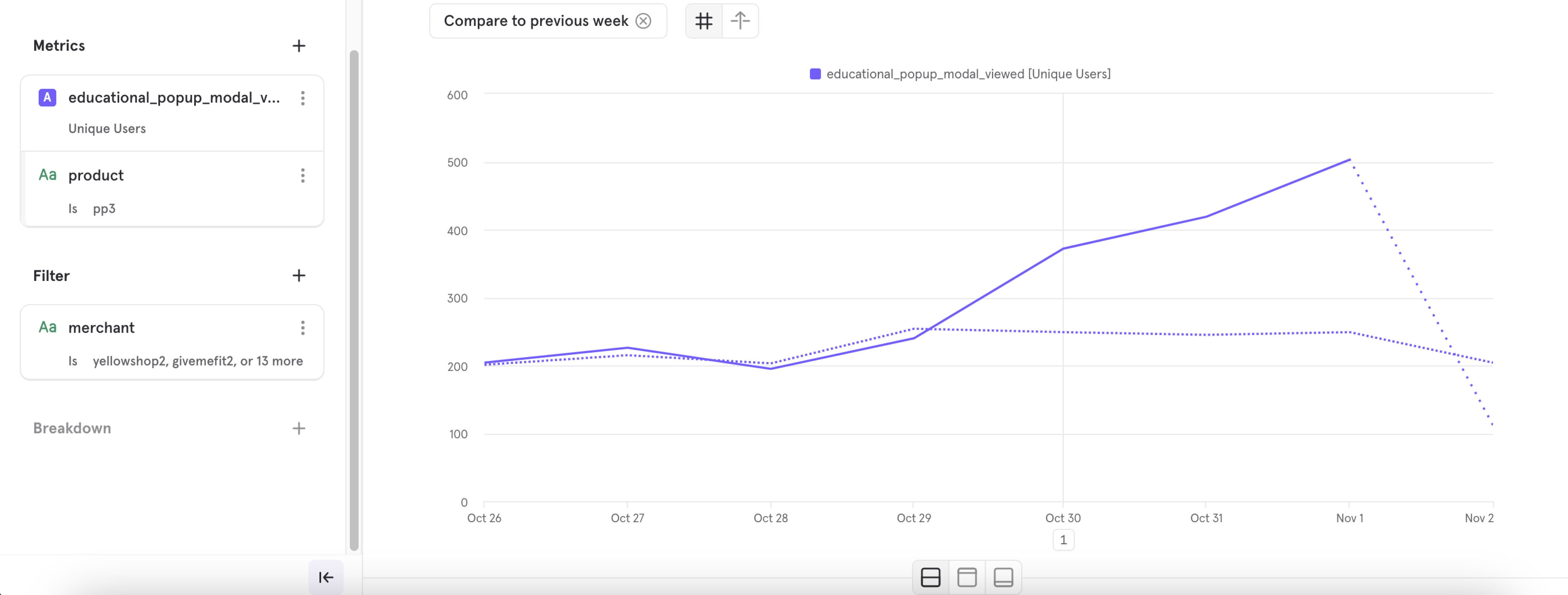
Clicks on the widget has increase more than 100%

native app

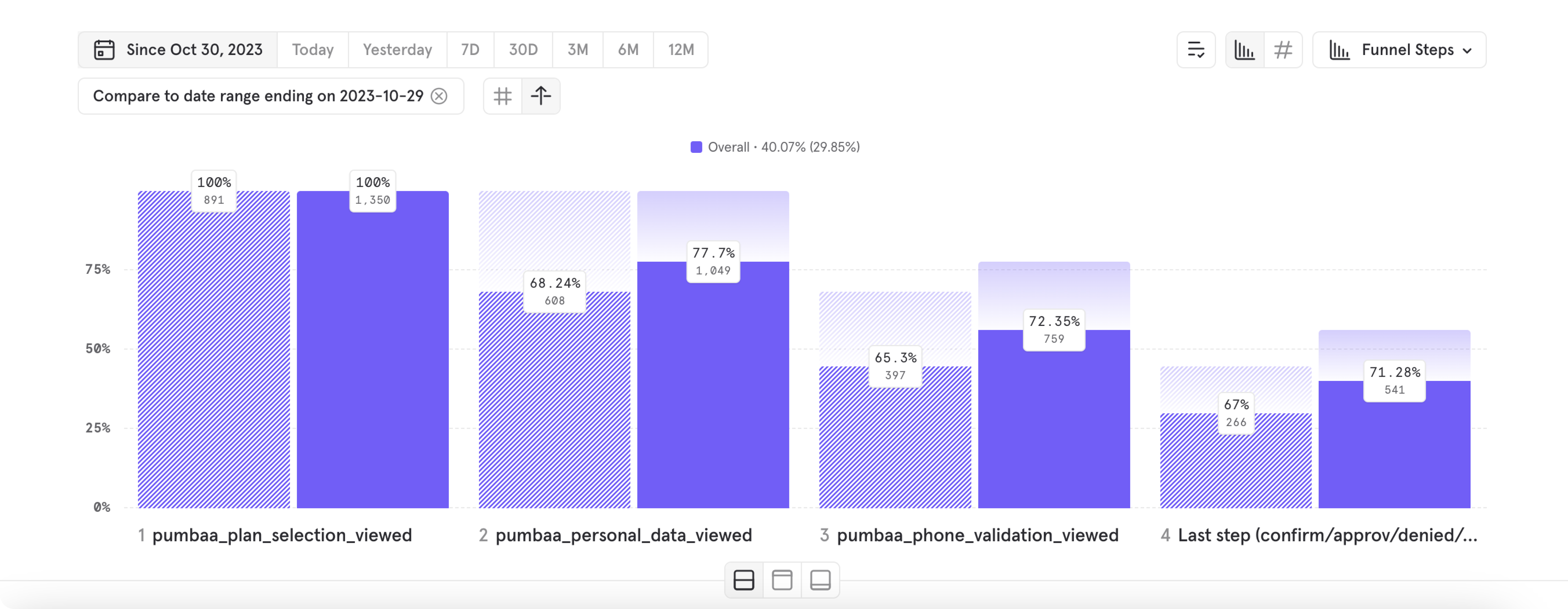
Completion rate at the checkout has increase 10%

native app